Let’s Talk About Those Free Resume Templates — 3 Things You Need to Know

Not all resume templates are created equal. Some are helpful as a starting point, but others can cost you an interview. Learn 3 warning signs of a bad resume template that Grandma says to watch out for.
By: Katelyn Skye Bennett | Contributor for Let’s Eat, Grandma
The fireplace flickered, illuminating a table strewn with glowing laptops and scratch paper. Today, Kara’s Freshman Business Seminar professor had assigned the class to draft their first resumes, and her classmates were debating best practices while she fidgeted.
“Use a resume template to make your life easier,” Niko urged.
“No, don’t use a template,” her cousin Raphaelle retorted. She was already focused on her five-year career plan, including landing a six-figure job out of college, though she mostly had community service experience so far. “They’re simplistic and won’t pass ATS.”
Want more job search tips? Sign up for our newsletter!
“Shut up and use one. You sure know a lot for being 18! Anyway, my mom says people who say otherwise are just trying to take your money.” Niko replied, determined to win this one. Kara frowned at her screen, wishing a professional could write her resume instead of having to figure it out by listening to the two bicker.
Raphaelle inserted her voice again before Kara could tell them to be quiet. “No, don’t use a template if you care about the quality of your resume!”
“What’s a person to do?” Kara sighed as she retreated to the kitchen to email the smartest person she could think of: Grandma. Surely she would have insight.
Kara clicked open the response from Grandma’s AOL address the next morning over breakfast and read that each of her friends’ statements had a grain of truth in them…
—-
From: Grandma <[email protected]>
Re: Resume Help?
07:42 AM
Dearest! It’s so good to hear from you.
I’ll get right to it since I have a class to teach soon and a paragliding lesson afterward.
There are a lot of resume templates out there, and you should be wary. Templates can give you a helpful framework from which to start, but a bad template can cost you an interview. And while it’s true that resume writing sites like mine offer to have trained experts write you a resume that will sell, we also strive to help you learn how to write a stellar resume yourself.
As your grandma, I am not completely against using resume templates. But I do want to help you choose wisely.
Even name-brand websites often offer a mixture of tried-and-true templates and sub-par scripts. The free ones you find are often free for a reason! If you decide to work with a pre-made template, keep the following three cautions in mind.
Additionally, please remember that templates are aptly named — they’re meant to give you a useful framework but be adjusted to your content, not just submitted with minimal changes.
1. Most templates are not ATS-friendly.
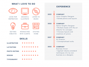
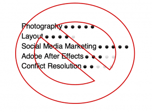
As much as you may love a good newspaper column, the look doesn’t work for resumes, mostly because Applicant Tracking Systems aren’t fans — they don’t read multi-column formats correctly. Skill bars are also a no-go, and personalized graphics like photos or logos aren’t recognized by ATS software. Tables and unique fonts won’t be picked up either.
As aesthetically pleasing as templates with those features might be, your content is more important. To make sure it is noticed by recruiters, your resume will have to pass through an ATS. From what I hear, your jobs from this summer are worth noting for that internship application! No need to stunt your chances by overstyling with formatting that ATS won’t recognize.
Speaking of experience…
2. Resume templates often lack space for Professional Experience.
You’ll find some that may have space for two to three positions but no more, and your professional experience is what will take up the bulk of your resume.
Adjusting them as your experience grows can prove finicky due to sticky pre-formatting. You’ll have to be adept at the computer program to keep the formatting consistent, since details like spacing and placement matter.
Plus, templates often only accommodate one page, and many experts are starting to agree that some resumes can be two pages. (There are several caveats to that, so write to me separately on that matter. Your entry-level resume won’t need that, but your future self might.)
3. They’re often too stylized and emphasize flash over substance.
We’ve seen some cute, colorful resume templates that are vibrant but impractical for most industries. While these are fun, they aren’t always conducive to readability.
Even if the resume template passes ATS (or won’t go through it if you submit it through your network), the layout may place your contact information, education, or skills in corners that aren’t always obvious.

That’s WAY too little room for professional experience… and none of those graphics would make it through ATS!
Contrary to popular belief, recruiters care more about easily finding what they want than being stunned by the visual appeal. Crisp, clearly laid out resumes are the way to go.
Creatives and entrepreneurs who are either working for themselves or applying within smaller networks where ATS is uncommon don’t have this concern. In the cases of graphic designers and other artists, the art is part of what matters. But for almost all industries, readability is more important.
Conversely, while some templates are overly flashy, with bright circles and squiggly infographics highlighting your contact information, others can look rigid or obvious, particularly if the template doesn’t let you play with the formatting enough to suit your needs. I know from experience that this can be frustrating.
In those cases, it’s more beneficial to use templates as examples to replicate on your own document, where you have more freedom to add content within a clean, ATS-friendly framework.
Thanks for writing, dear. I hope this has helped you identify what templates to avoid and given you insight on ones that might be more useful. Good luck with your assignment.
Sincerely,
Grandma
Want more job search tips sent straight to your inbox? Sign up for our newsletter here:
Better Resume.
Satisfying Career.
Happier You.

